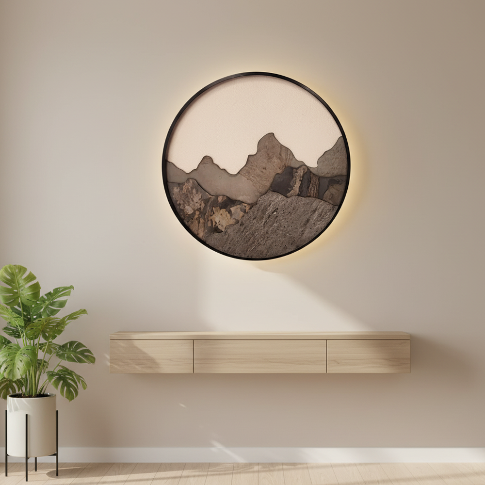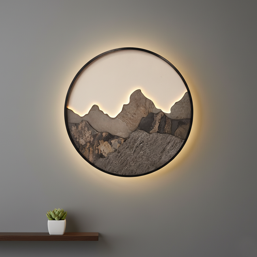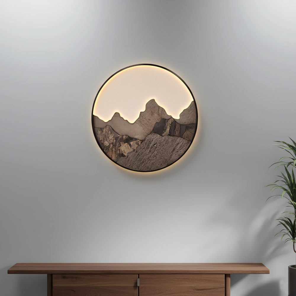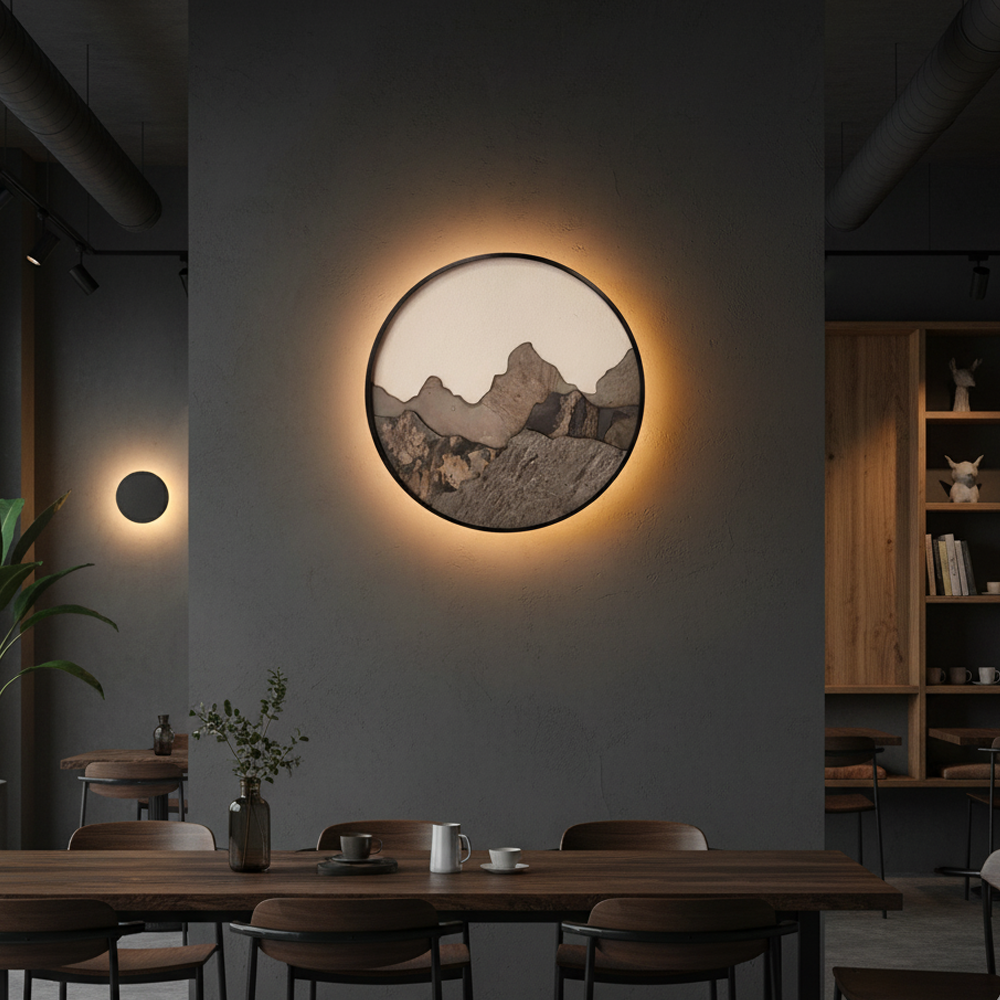

Two numbers are read when choosing a luminaire, and both are printed on the box: the lumen and the kelvin. The first says how much light you get, the second whether that light looks warm or cool. Read correctly, these two numbers let a room be lit by calculation rather than by guesswork; read wrongly, even the most expensive fitting leaves the room either dim or glaring. This guide covers the move from the watt habit to the lumen calculation, the ranges each room needs, a naming confusion that leads to wrong purchases, the rendering value that makes colours look right, the logic of layered lighting, the causes of glare and the flicker problem that shows up when dimming.
Watt is a unit of power, lumen is a quantity of light
For many years bulbs were made with incandescent technology, so the watt became a practical stand-in for the amount of light: everyone knew how much a sixty-watt bulb lit. But the watt never measured light; it measured the electrical power consumed. Once sources that give the same light on far less power became common, the habit turned misleading.
Today the correct measure is the lumen. The lumen gives the total visible light a source emits and is independent of technology. Two products with the same wattage can have markedly different lumen figures, and that difference goes straight into your pocket and into how bright the room is.
Reading the two together is also useful: dividing a product's lumens by its watts gives the light per watt. The higher that figure, the less electricity you spend for the same brightness. Both lumen and watt figures are printed on the product label when you compare.
A third trap is assuming that the lumens a bulb gives and the light the luminaire delivers into the room are the same thing. A closed diffuser, thick glass or a deep housing holds back part of the light. The lumen figure stated for a luminaire can therefore be lower than that of the bulb inside it.
- Watt shows the power consumed, lumen the light produced.
- Compare products on the lumen figure, not the wattage.
- Lumens ÷ watts gives light per watt — the higher, the more efficient.
- The light a luminaire delivers can be lower than the bulb's lumen figure.
Lumens per square metre: starting points room by room
A room's need is worked out in lumens per square metre. The commonly used starting ranges are: 100–150 lumens per square metre for a living room, 150–200 for general kitchen lighting, 75–150 for a bedroom, 150–200 for a bathroom, around 100 for corridors and entrance halls, and 100–150 for stores and plant rooms.
Task areas sit outside these ranges and want higher figures. The kitchen worktop and the desk are surfaces where work is done; there a separate source is added on top of the general lighting and the level on the surface is raised markedly. Even where a living room's general light is sufficient, the reading chair in that same room needs its own lamp.
The calculation has three steps: measure the room's floor area, pick the matching range from the table, and multiply. For a twenty square metre living room at 120 lumens, the total comes to roughly 2,400 lumens. You do not have to load that total onto one luminaire; spreading it across several sources both softens shadows and reduces glare.
Three factors decide where in the range you land: how light the wall and ceiling colours are, the ceiling height, and how much daylight the room gets. Dark walls absorb light, a high ceiling moves the source away from the surface, and little daylight creates a need for artificial light before evening. All three push you towards the upper limit.
- Total need = room area × the chosen lm/m² figure.
- Worktops and desks are calculated on top of the general lighting.
- Dark walls, high ceilings and little daylight push you to the upper limit.
- Spread the total across several sources, not one luminaire.
Kelvin, and why the word on the box cannot be trusted
Colour temperature is measured in kelvins and describes the character of light along the range from yellow to white. Between 2700 and 3000 kelvins the light is warm and close to yellow; around 4000 kelvins it is neutral, without yellow and close to white; between 5000 and 6500 kelvins it looks cool and slightly blue. The higher the number, the cooler the light.
Here there is a naming confusion that produces buying mistakes, and it matters most when you buy across markets. In the Turkish market, 4000K is commonly labelled "daylight" and the usage is well established. In international catalogues, however, the equivalent term covers the 5000–6500K range. The same word describes two different lights in two markets.
The conclusion is this: choosing by name is risky. Terms such as warm, soft, white and daylight shift with the market and the manufacturer; the kelvin figure does not. Look at the number on the label, and keep that number the same across every luminaire you bring into one room.
Products with adjustable colour temperature let you postpone the decision: the same luminaire can give neutral light in the morning and warm light in the evening. Where a product has this feature it is stated in the description, and it is used in steps from a remote or a wall switch.
- 2700–3000K warm · around 4000K neutral · 5000–6500K cool and close to white.
- In the Turkish market the term "daylight" is commonly applied to 4000K.
- In international catalogues the same term covers the 5000–6500K range.
- Choose by the kelvin figure on the label, not by the name.
Colour rendering: where does colour matter?
Colour rendering describes how accurately a light shows the colour of objects, and it appears on product labels as CRI or Ra. It is given out of a hundred; the higher the number, the closer colours come to how they look in natural light. Under a source with low rendering, reds go flat, skin looks pale, and two different fabrics can be taken for the same colour.
The lower threshold commonly sought in general interior lighting is eighty. Where colour drives a decision, ninety and above is preferred: the kitchen worktop, in front of the bathroom mirror, the dressing room, the make-up area, tables for painting and handwork, and display cabinets.
Colour rendering and colour temperature are often confused but are two independent values. A light can be both warm and high rendering; it can equally be cool and low rendering. Kelvin describes the colour of the light, rendering describes how accurately that light shows other colours.
If this figure is not on the product label, it is not to be assumed. Before putting a product with no stated rendering value into an area where colour is decisive, the right move is to ask the seller.
- Common lower threshold in general interiors: Ra 80.
- Ra 90 and above is preferred at worktops, mirrors and display areas.
- Colour temperature and colour rendering are separate values; neither implies the other.
- If rendering is not on the label, the value is not assumed but asked for.
Layered lighting: general, task and accent
A well-lit room is not built with a single luminaire. Three layers work together. General lighting gives the room its base light and lets you move around safely; a ceiling fitting, a flush light or a chandelier carries it. Task lighting lights the surface where work is done: a reading lamp, an under-cabinet strip, a desk lamp. Accent lighting brings forward a picture, a niche or a texture.
The most concrete benefit of a layered scheme is shadow control. Light from a single point casts your own shadow onto the surface you are working on. When a second source comes from a different angle that shadow softens and the work gets easier. The same result is far clearer in a kitchen: the ceiling fitting leaves a surface in shadow the moment you stand in front of the worktop.
The second benefit is flexibility. When layers go on separate switches, the room adapts to different needs through the day: everything on for cleaning, only accent and task lights in the evening. That is better than one large luminaire, both for comfort and for energy.
When planning the layers, keep the colour temperatures close to one another. Two sources with different kelvin values lighting the same surface create a colour mismatch the eye notices at once and make the room look untidy.
- Three layers: general, task and accent — none replaces another.
- Task lighting breaks the shadow; a single ceiling fitting cannot.
- Put the layers on separate switches so the room adapts through the day.
- Keep the colour temperature of sources in one space close together.
Glare: where should the light come from?
Glare is a light source appearing excessively bright against its surroundings and making seeing harder. The problem usually lies not in the quantity of light but in its coming straight into the eye. Of two luminaires with the same lumen figure, one can be uncomfortable and the other comfortable; what makes the difference is whether the source itself is visible.
In offices and workspaces a measurable indicator is used for this discomfort and appears in product documents as UGR. The lower the number, the less the glare; in areas worked at a screen, values below nineteen are commonly sought. In homes this figure is not given for every product, but the same principle holds.
The practical answers are simple. Enclosed or matt-diffused luminaires spread the light and remove the bright point. Indirect luminaires that throw light onto the ceiling or wall leave no source aimed at the eye. With adjustable spots, turning the angle towards the wall or a surface rather than the seating position prevents most of the glare.
Shiny surfaces multiply glare. A polished table, a glass worktop or a glossy floor carries the reflection of the ceiling source into the eye. In such spaces, indirect lighting or matt-diffused luminaires are markedly more comfortable.
- Glare usually comes not from the amount of light but from the source being directly visible.
- In areas worked at a screen, UGR below 19 is commonly sought.
- Matt diffusers and indirect lighting remove the bright point.
- In spaces with shiny surfaces, reflection is counted in as well.
Dimming and flicker
Dimming is the most effective feature for making the same luminaire suit different jobs: low brightness in the evening, full power for cleaning. Not every light source can be dimmed, though. For a system to dim, both the luminaire or bulb and the dimmer used have to be suitable. If dimmability is not stated in the product description, it is not to be assumed.
An incompatible dimmer announces itself in three ways during dimming: the light will not go below a certain point, it flickers on and off at low level, and the dimmer hums. These signs do not mean the product is faulty; they mean the two parts do not work together.
Flicker is a separate matter and can appear without any dimming. A light source switching on and off very fast is not always noticed by eye, but it can cause fatigue and headaches in people working under it for long periods, and bands appear on screen when filmed. The most practical way to check is to point a phone camera at the luminaire.
In areas used for long stretches — a desk, a child's homework corner, an office — products with low flicker are preferred. Some product descriptions state this; where they do not, it should be asked before buying.
- Dimmability is a shared property of both the light source and the dimmer.
- Humming, flickering on and off, and sticking at a lower limit are signs of incompatibility.
- The fastest way to spot flicker is to look through a phone camera.
- In areas used for long stretches, choose low-flicker products.
What to check on the label before buying
The label of a luminaire or bulb carries, on its own, the information needed for every decision in this guide. The fields to look at in order are: the lumen figure, the kelvin figure, colour rendering, dimmability, base type and maximum power, protection rating and body dimensions.
If one of these fields is blank, that information is not to be assumed. If the label gives no lumen figure, how much the product lights is unknown; if it gives no kelvin figure, matching with the other luminaires in the room cannot be guaranteed. Missing information may not be a defect, but it calls for a question rather than a guess when deciding.
One final check is the dimensions of the room you are buying for. Compare the total lumens you calculated with the sum of the lumen figures of the luminaires you chose. If the two numbers are far apart, the problem is not in the model but in the planning — and it is far easier to fix before installation.
- To check on the label: lumens · kelvins · colour rendering · dimmability · base type and maximum power · protection rating.
- A value that is not stated is not assumed; it is asked for.
- Compare the calculated total lumens with the sum of the chosen luminaires.
- A planning error is corrected before installation, at the lowest cost.
Room-by-room starting table for lumens and colour temperature
| Area | Starting range | Colour temperature | Note |
|---|---|---|---|
| Living room | 100–150 lm/m² | 2700–3000K | Add a separate task lamp at the reading chair |
| Kitchen (general) | 150–200 lm/m² | Around 4000K | The worktop is calculated separately |
| Kitchen worktop (task) | Extra source on top of the general lighting | Around 4000K | Under-cabinet strip to break the shadow |
| Desk (task) | Extra source on top of the general lighting | Around 4000K | A low-flicker product is preferred |
| Bedroom | 75–150 lm/m² | Around 2700K | A separate, dimmable source at the bedside |
| Bathroom | 150–200 lm/m² | 3000–4000K | Mirror separately; check the protection rating |
| Corridor and hall | Around 100 lm/m² | 3000–4000K | Several sources at equal spacing |
| Store and plant room | 100–150 lm/m² | Around 4000K | Colour rendering is secondary here |
Related guides: Choosing a Wall Light: Up-Down, Wall Washer and IP Rating, Choosing an LED Bulb: Base Type, Watts, Lumens and Colour Temperature, IP Ratings for LED Fixtures: Bathroom, Kitchen and Outdoors, Ceiling Lighting Types: Spot, Linear, Cove Lighting, and Chandelier. For product options for your project, see our LED Lighting page.